L
o
a
d
i
n
g

08-November-24
When it comes to designing or redecorating your home, one of the most crucial decisions you’ll make is choosing the color scheme. The right combination of colors can set the mood, define the style, and even impact how you feel in the space. But with so many options available, where do you begin? This guide will walk you through essential tips and strategies to help you pick the perfect color palette for your home.
Color theory is a foundational element of design that explains how different hues interact and affect our perception. Understanding the basics can help you make more informed choices:
Tip: Familiarize yourself with the color wheel to identify complementary (opposite each other) and analogous (next to each other) color schemes, as they often create visually pleasing combinations.
Each room in your home serves a different purpose, so the color you choose should reflect the desired ambiance. Here are some common associations:
Choosing a dominant base color will help anchor your space. This color should be used across large areas like walls or significant furniture pieces. Once you’ve selected your base, build a palette using complementary or accent colors to add depth and interest.
Design Tip: Neutral colors like beige, gray, or soft white work well as base colors because they allow for versatility in decor and accessories.
One classic rule interior designers follow is the 60-30-10 rule:
This proportion helps create balance and keeps your space from looking too monotonous or chaotic.
Colors often appear different depending on lighting conditions. Natural light, incandescent light, and fluorescent light can all change how a color looks. Before committing, test your chosen hues by painting small sample patches on your walls or using swatches.
Pro Tip: Observe your samples at different times of the day to see how the color changes as the light shifts.
Colors can influence mood and behavior, so understanding color psychology can be a game-changer. Here are some key insights:
If you’re feeling stuck, look for inspiration in places such as:
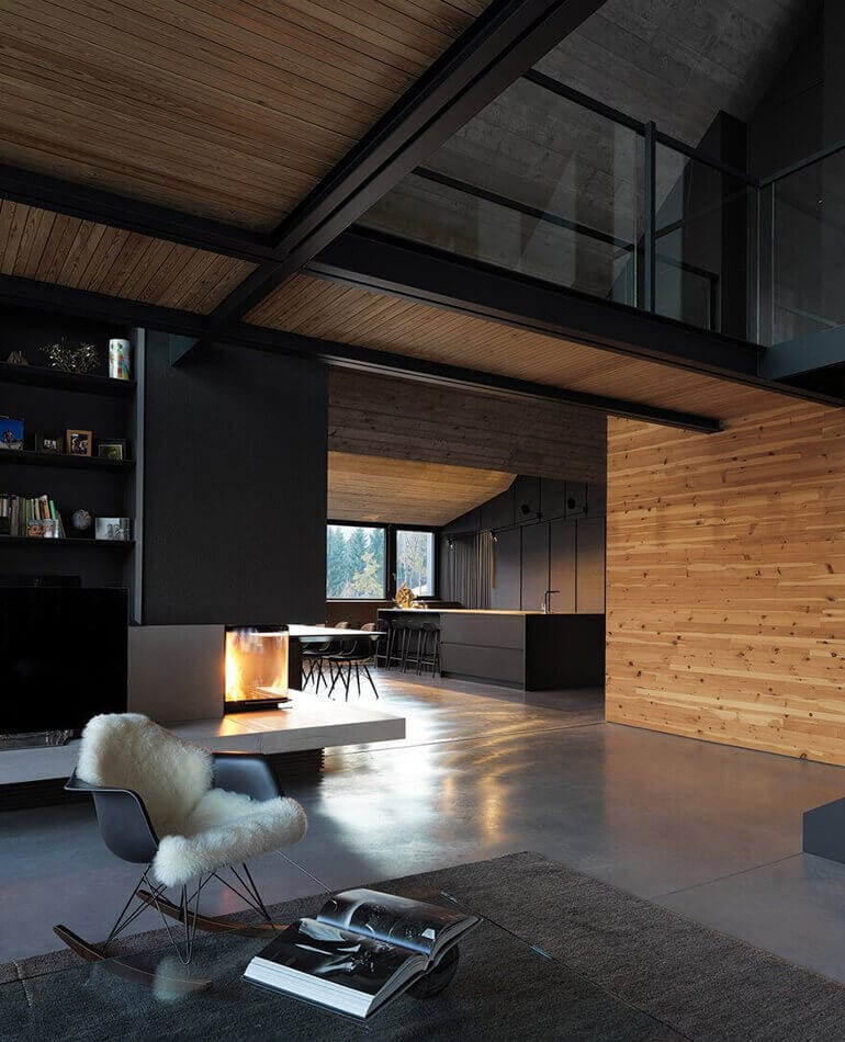
Architectural details like crown moldings, fireplaces, or exposed beams can influence your color scheme. A home with classic details may pair well with timeless, elegant colors like creams and muted greens, while modern spaces often look best with bold or monochromatic palettes.
If your home has features that won’t be changing, such as flooring, cabinetry, or countertops, make sure your chosen colors complement these elements. A cohesive look ties all parts of your space together seamlessly.
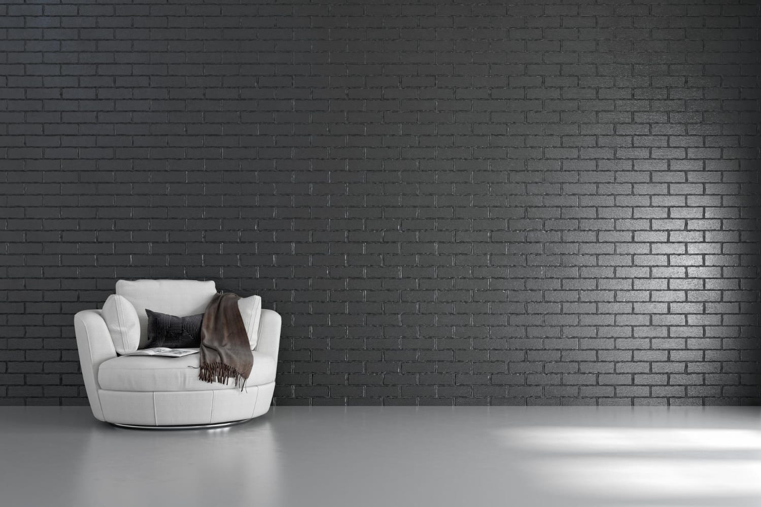
Accent walls can be a powerful way to introduce color without overwhelming the space. Choose a single wall to paint in a standout color or use wallpaper with an interesting pattern to create a focal point.
Design Insight: Accent walls work best when used sparingly and thoughtfully, so they don’t disrupt the room’s balance.
Choosing the perfect color scheme for your home is both an art and a science. By understanding color theory, considering the mood of each space, and testing your choices, you can create a cohesive and inviting atmosphere. Don’t be afraid to express your personality through your color choices—after all, your home should be a reflection of who you are.
Whether you prefer classic neutrals or bold, statement-making hues, the right color palette will make your home not only look beautiful but also feel just right.